

Niki Li
No.1 BEST
CHINESE TATTOO SHOP
Treated more as an aesthetic, instead of a language, Chinese characters have made an impact on visual cultures of the West. Westerners like to have Chinese tattoos without actually knowing the cultural context they carry, and sometimes even the actual meaning of the words.
To create an open dialogue on how the West is capitalizing on the “exotic charm” of the Chinese language, this pop-up store project presents a conceptual space that displays a series of tattoos that use original fonts and graphics that Niki designed. The tattoos combined highly stylized English letters with the aesthetics of Chinese brush strokes to resemble Chinese characters. These tattoos play with the illegibility and exoticism of Chinese characters while selecting humorous phrases from popular culture and every day slang.
The audience is welcome to lounge around, purchase products with tattoo graphics, and apply the temporary tattoo stickers onto their body, while the artist Niki was playing the role of the shop assistant. The intention behind this interaction is to show how cultures can be appropriated, reclaimed and repurposed by other cultural backgrounds and perspectives, sometimes creating a cultural disparity in which feeble attempts at understanding can promote misinterpretation and ignorance rather than transparency, respect, and clarity.


No.1 Best Chinese Tattoo Shop


BOOK DESIGN
<Untranslation - Disunderstanding - Disinterpretation>
By showing cross-cultural misinterpretations and the intentionality of modified forms of English and Chinese, this artist book is about how cultural signifiers can be repurposed and reclaimed. The book focuses on how cultural disparity and people’s feeble attempts to understand different cultural heritages can promote ignorance, rather than transparency, respect and clarity.
This project won The First Prize of The Cathryn Griffith Award in the Graphic Arts Annual, 2018
Finish size:
7" x 7"
60 pages
Hardcover
1st Edition
 |
|---|
 |
 |
 |
 |
 |
 |
 |
 |
 |
 |
 |
 |
 |
 |
 |
 |
MARKETING GIFT KIT
Gift kit designed for Laguarda.Low Architects's marketing purposes.
The kit includes 2 brochures, 1 poster, and 1 USB drive.


SHOW BOOTH
Trade show booth designed for Laguarda.Low Architects at the 2019 MAPIC, an international retail property market event for key property players and cities to build the ultimate lifestyle and shopping destinations.
Dates: Nov 13, 2019 – Nov 15, 2019


CONNECTED BOSTON
PROJECT
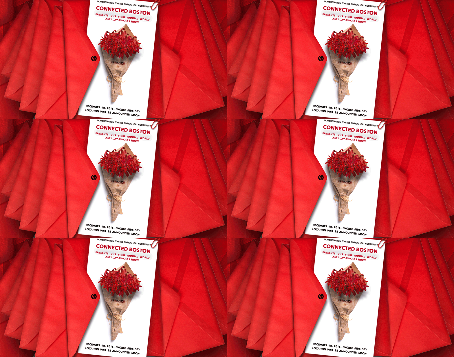
Posters and gifs designed for Connected Boston -- a program of The Multicultural AIDS Coalition (MAC), Boston's No.1 health navigator for LGBTQ people.
POSTERS


GIFS
 |  |  |
|---|
PUBLIC DISPLAY


SOCIAL MEDIA / PRINT COLLATERAL


ANIMATIONS
Animations created for Laguarda.Low Architects, a NYC-based architecture firm.
VIDEOS
Videos created for Laguarda.Low Architects, a NYC-based architecture firm.
GIFs
GIFs created for Kel & Partners, a Boston-based social media and public relations agency.
Clients: Cumberland Farms, So Clean, UberDoc, International Design Guild, Flooring America, Wasabi


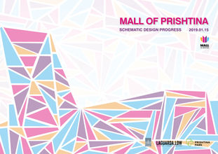
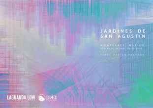
PRESENTATION COVER DESIGN


POSTERS
Propaganda

This poster has been collected by Print Power, a propaganda distribution system organized by Damir Porobic of the University of Southern Maine and Brian Reeves of Boston College and Southern Maine Community College. The poster has been exhibited at the W. Van Alan Clark Jr. Library at The School of the Museum of Fine Arts at Tufts University and at the AREA Gallery at the University of Southern Maine's Portland campus at the Woodbury Campus Center.

This poster has been collected by Print Power, a propaganda distribution system organized by Damir Porobic of the University of Southern Maine and Brian Reeves of Boston College and Southern Maine Community College. The poster has been exhibited at the W. Van Alan Clark Jr. Library at The School of the Museum of Fine Arts at Tufts University and at the AREA Gallery at the University of Southern Maine's Portland campus at the Woodbury Campus Center.


Music Event Posters


Posters Designed for Asian American Writers Workshop
Established in 1991, AAWW is a national not-for-profit arts organization devoted to the creating, publishing, developing and disseminating of creative writing by Asian Americans.


LOGOS

This logo was designed for a beauty salon named Garden Bijou. The abstract cursive writing of "Bijou" resembles a lady's face with red lips, which reflects the attributes of the beauty salon.

This logo was designed for The Ask & Tell Project, an online campaign aiming to build a community for LGBTQ military veterans and servicemembers through which they can share their stories and make connections. The font used for this logo is ITC Machine Medium, which is the same font as the US Army logo. This font choice consists with the attributes of this project. (check out the link below to learn more)

This logo was designed for Periodical, an online application designed by my teammates and I that maps the location of free and accessible menstrual products to promote the idea of hygienic products as necessities, rather than luxury goods. Four tampons form a circle which symbolizes the period and circulation. The pink drop also represents menstruation. The overall image also looks like a breast, which implies the feminine paradigm of this group. (check out the link below to learn more)

This logo was designed for Periodical, an online application designed by my teammates and I that maps the location of free and accessible menstrual products to promote the idea of hygienic products as necessities, rather than luxury goods. This logo is a combination of a drop and a tampon together in the shape of an exclamation point. The exclamation point is meant to make the audience associate the logo and overall cause as important. (check out the link below to learn more)

This is the logo for an original fashion brand I started in 2015. "LYN" is the English abbreviation of my Chinese name while the character "立" in Chinese means "standing" and "independent". I fused "LYN" into the "立" character in order to express my determination to be an independent person. LYN also represent "liberal”, “young" and “natural."


